There are bad websites, and then there is Arngren.net, a Norwegian shop selling electric bikes, ATVs, telescopes and, because apparently that's not enough, kits to build your own two-seat helicopter. And they put almost all of it on the homepage. At the same time.
There's a useful lesson hiding in all that chaos: everything can't be the most important thing.
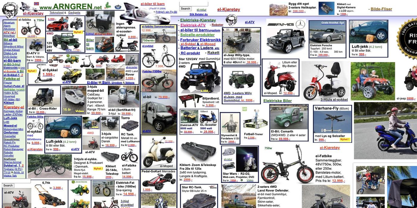
- Everything shouts at once. Product photos, prices, links and promotions compete for attention in every direction, with no obvious place to start.
- It's an internet legend. Its 2003 homepage is part of the Web Design Museum's collection of bad and ugly websites.
- Equal weight is the problem. A 29-kroner bike accessory and an electric Porsche get practically the same billing, so the customer has to figure out what matters.
- One thing Arngren gets right. It's remarkably direct. Prices, phone number and email are all right there, which is more than plenty of beautiful, modern websites manage.
Why this matters to you
A good homepage should make three things clear: what you do, what matters most, and what someone should do next. But it's also doing something less obvious. It's telling your customer what kind of business you are and, more importantly, how they should feel about doing business with you.
Arngren may be saying, “We have a lot going on over here.” Maybe that's intentional. But most businesses want their website to communicate something very different: We're reliable. We're credible. We know what we're doing. You can trust us.
That's the real job of good design: every choice you make, from the words you use to what you leave out, sends a message to the person on the other side of the screen.
Give people enough information to make a decision to choose you, but don't make them hunt for information or get lost in the sauce. Your homepage should not be your entire business. It's simply the front door, which should say: Welcome.

Jason Schlosser is the founder of ji design. He’s spent his career building businesses in hospitality, where he fell in love with the combination of marketing, design, and the art of making people feel welcome.
That experience shapes how he thinks about websites today: they should feel welcoming, build trust, and make it easy for people to take the next step with your business.